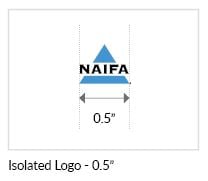
 For the NAIFA logotype to be recognized, it must be readable in all communication efforts. Therefore, the minimum width of the logotype should be 0.5”. The minimum width of the logotype with a tagline should be 0.625” and the minimum width of the logotype with the full name should be 2.25”. This will help ensure that the signature always maintains its presence and clarity each and every time it is used.
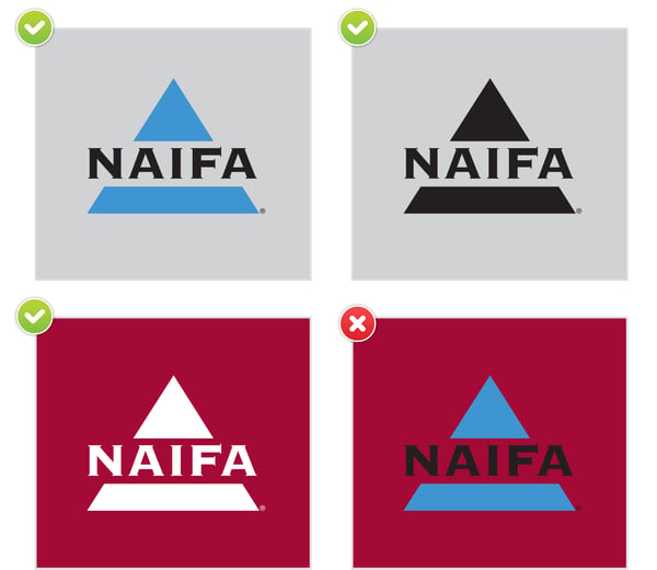
The NAIFA logotype in any of its forms must appear clear and visible at all times. The ideal background for the logo in two-color is white. If a white background is not possible, the two-color version of the logo may be placed on a gray background whose value is no more than 25% black.
If a white or 25% black background is not possible, the logo should appear in either black or white, whichever option provides maximum legibility and contrast for the logo and the tagline.
When the background color is blue PMS 2925, the NAIFA logo should appear in white.
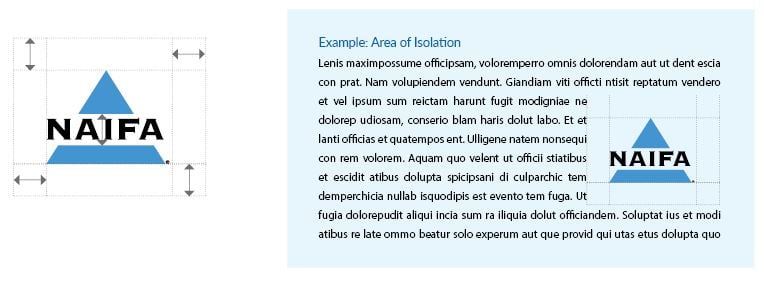
Another important factor for helping the corporate signature to stand out is maintaining an “Area of Isolation” around the logotype. An “Area of Isolation” helps eliminate any confusion that may result when other logos or product names are included on your communications efforts. An easy rule of thumb is to measure the white space between the triangle “top” and the triangle “bottom” in the NAIFA logotype to determine the amount of isolation area needed. Then add that amount of space to all four sides of the logotype. Graphic elements such as rules and bars are exceptions.
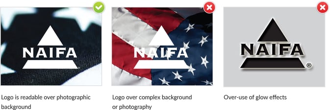
Avoid the use of the NAIFA logo over busy graphic elements such as photos or illustrations. When layout dictates that the logo must overlap with other graphic elements, simple background treatments behind the logo such as glow effects are allowed. Avoid over-use of such effects or the use of more than one effect at the same time.
Copyright © 2020 NAIFA
National Association of Insurance and Financial Advisors
1000 Wilson Boulevard, Suite 1890
Arlington, VA 22209
Phone: 877-866-2432
info@naifa.org